Remix is an exciting new React framework that promises to help us “build better websites.” Despite only being open-sourced on 22 November 2021, it finished the year as #4 in the JavaScript Rising Stars React category.
I wanted to see how dark mode would be implemented with Remix. So I turned to the largest open-source app built using Remix - Kent C. Dodds’ blog.
In this post, we’ll look at how Kent implemented dark mode. We’ll cover:
- How Remix helps us easily manage a cookie session.
- How to call backend actions that aren’t associated with a specific route.
- How to make sure the pre-hydration state aligns with the post-hydration state.
Let’s take a look at how we’re going to eat this elephant:
- Adding dark mode without a toggle. Remix makes it unbelievably easy to add a theme based on the user’s system preferences.
- Creating a naive switch. We’ll use React context to store our theme value and toggle it when a button is clicked.
- Choosing the initial state from user preference. We’ll choose our initial state dynamically based on the user’s system preference. We’ll also look at how to get the correct initial theme before the page has hydrated.
- Remembering the user’s choice. We’ll store the user’s preference as a cookie so we remember it for future sessions. This is where the power of Remix really shines.
- Finishing touches
This is a long post so if you feel like you already know how to do certain steps, feel free to jump ahead to the later steps.
0. Adding dark mode without toggle
Let’s look at two ways of adding dark mode: using CSS variables and using Tailwind.
CSS Variables
To add a dark mode using CSS variables, create a variable for each colour that will be affected by the change in themes. Then create a second CSS file that defines the “dark” variant of those variables.
html {
  --text-colour: black;
  --background-colour: white;

  color: var(--text-colour);
  background-color: var(--background-colour);
}html {
--text-colour: white;
--background-colour: black;
}Both stylesheets can be added in the usual Remix way. We can use the link media query prefers-color-scheme: dark for the dark styles. This will give the <link> tag a media attribute so that the stylesheet is only applied if the user’s system settings prefer dark mode.
import type { LinksFunction } from '@remix-run/node';
import mainStyles from './styles.css';
import darkStyles from './dark.css';

export const links: LinksFunction = () => {
  return [
    {
      rel: 'stylesheet',
      href: mainStyles,
    },
    {
      rel: 'stylesheet',
      href: darkStyles,
      media: '(prefers-color-scheme: dark)',
    },
  ];
};
Tailwind
According to the Remix docs, “the most popular way to style a Remix application in the community is to use tailwind”. Adding dark mode to an application using Tailwind is as simple as updating tailwind.config.js to use a media dark mode strategy:
module.exports = {
  darkMode: 'media',
  // ...
};
Then we add our dark mode styling by using dark:{class} and tailwind will handle adding the media query for us.
<div className="bg-white dark:bg-gray-900">
  <h1 className="text-gray-900 dark:text-white">Hello world</h1>
</div>
1. Naive Dark Mode Switch
Rather than just choose our theme based on the user’s system preferences, let’s allow them manually choose a theme. Here’s our initial approach:
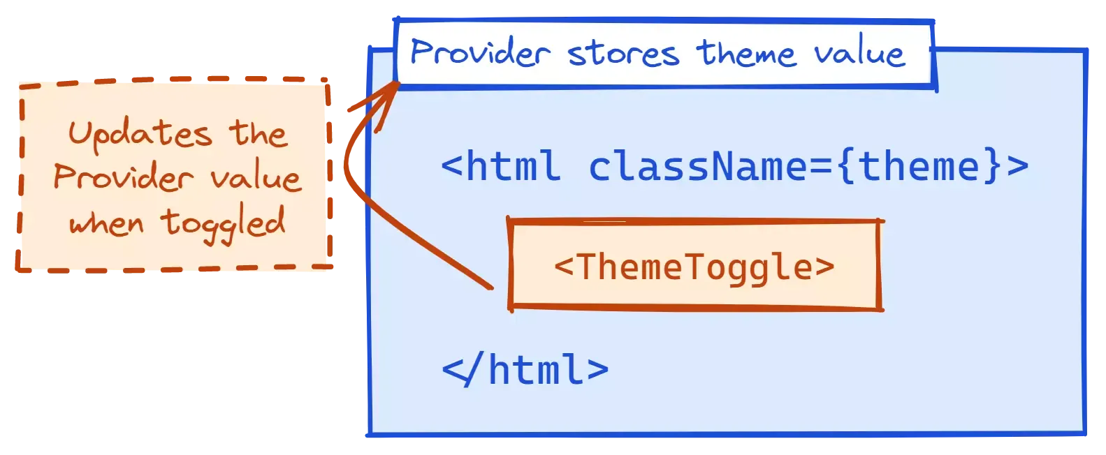
- We’ll wrap our app in a Provider which will store our current theme value.
- The
<html>tag will be given a class based on what value the Provider has. - The CSS will update based on which class the
<html>tag has. - Our theme toggle will toggle the value stored by the Provider.
Create the Theme Provider
Let’s start with our Provider. We’ll hold the current theme value in state (with light mode as the default). Then we’ll create a hook, useTheme, that can be used to get the current theme value and a setTheme function.
import { createContext, useContext, useState } from 'react';
import type { Dispatch, ReactNode, SetStateAction } from 'react';

enum Theme {
  DARK = 'dark',
  LIGHT = 'light',
}

type ThemeContextType = [Theme | null, Dispatch<SetStateAction<Theme | null>>];

const ThemeContext = createContext<ThemeContextType | undefined>(undefined);

function ThemeProvider({ children }: { children: ReactNode }) {
  const [theme, setTheme] = useState<Theme | null>(Theme.LIGHT);

  return <ThemeContext.Provider value={[theme, setTheme]}>{children}</ThemeContext.Provider>;
}

function useTheme() {
  const context = useContext(ThemeContext);
  if (context === undefined) {
    throw new Error('useTheme must be used within a ThemeProvider');
  }
  return context;
}

export { Theme, ThemeProvider, useTheme };
Set the HTML ClassName
Now that we have our theme value available from context, we can set the className on our html tag.
Remix makes this easy for us. Rather than just exposing a section of the body, Remix lets us “[render] everything about our app. From the <html> to the </html>.”
We can wrap our root component in our ThemeProvider. This will let us use useTheme in the App component to get the current theme and set the html element’s class.
import clsx from 'clsx';
import { ThemeProvider, useTheme } from '~/utils/theme-provider';

function App() {
  const [theme] = useTheme();

  return (
    <html lang="en" className={clsx(theme)}>
      {/* ... */}
    </html>
  );
}

export default function AppWithProviders() {
  return (
    <ThemeProvider>
      <App />
    </ThemeProvider>
  );
}Update the Styling
We’ll use the same general approach for styling as we did for step 0, with a few tweaks.
CSS Variables: Instead of defining the dark CSS variables in a separate CSS file, let’s move them all to the same file but have the dark-mode variables apply when HTML has the class “dark”.
html.dark {
  --text-colour: white;
  --background-colour: black;
}Tailwind: Update the config to use the class strategy.
module.exports = {
  darkMode: 'class',
  // ...
};
Add a Toggle
Finally, let’s create a route with a button that toggles the theme.
import { Theme, useTheme } from '~/utils/theme-provider';

export default function IndexRoute() {
  const [, setTheme] = useTheme();

  const toggleTheme = () => {
    setTheme((prevTheme) => (prevTheme === Theme.LIGHT ? Theme.DARK : Theme.LIGHT));
  };

  return <button onClick={toggleTheme}>Toggle</button>;
}
2. Initial State From User Preferences
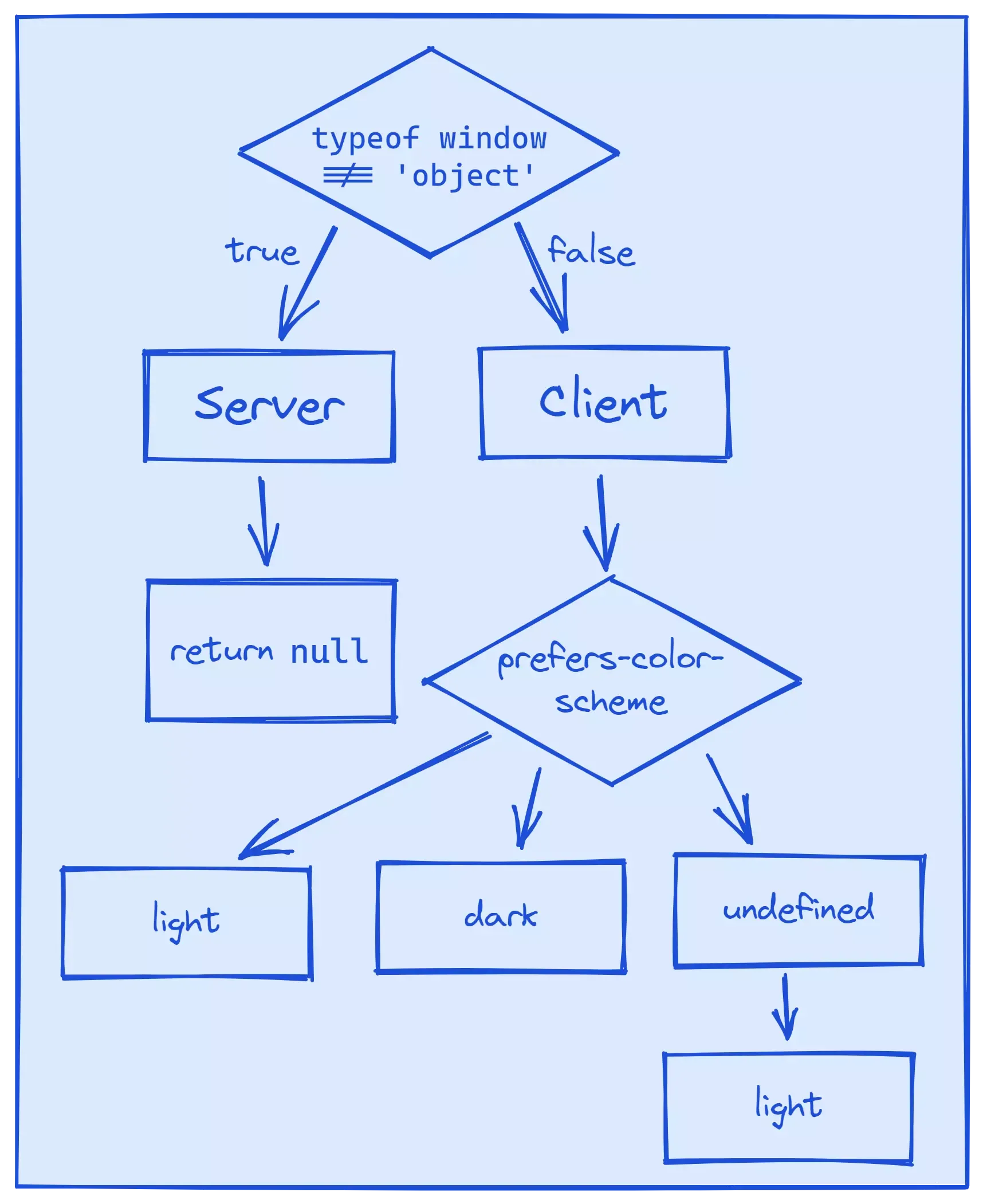
Instead of using light as everyone’s default, we’ll check to see if they’ve set a media preference in their system settings. If they’ve said they prefer dark mode, we can use dark as our initial state.
The complication comes because we’re using server-side rendering (SSR). When the initial state is being calculated on the server, it won’t know what the user’s media preferences should be - it’ll have to wait for the client to calculate that.
Fortunately, useState allows us to pass an initialiser function to set the initial state. We can test if the global window variable has been defined. If it is, we know we’re on the client and we can try and get the user’s media preferences. Otherwise, we’ll return null.
Let’s head over to our ThemeProvider and update the initial state of theme.
const prefersDarkMQ = '(prefers-color-scheme: dark)';
const getPreferredTheme = () => (window.matchMedia(prefersDarkMQ).matches ? Theme.DARK : Theme.LIGHT);

function ThemeProvider({ children }: { children: ReactNode }) {
  const [theme, setTheme] = useState<Theme | null>(() => {
    // there's no way for us to know what the theme should be in this context
    // the client will have to figure it out before hydration.
    if (typeof window !== 'object') {
      return null;
    }

    return getPreferredTheme();
  });

  return <ThemeContext.Provider value={[theme, setTheme]}>{children}</ThemeContext.Provider>;
}
LGTM, ship it! 🚀🚀
But wait… it doesn’t work. When a “prefers dark mode” user opens our app, the app’s initial theme is still light mode. And when the user clicks the “toggle” button, the first click doesn’t do anything 😱
Let’s debug to see what is happening here.
- Our initial state in the provider is correct, but the class isn’t being added to our
htmltag. - We’re also getting an error in the console complaining that our server and client states are out of sync.
Prop className did not match. Server: "" Client: "dark"
Our initial HTML is being rendered on the server, where our initial theme is null. This is rendered before hydration, meaning before the JavaScript on the page is loaded. So our initial <html> element has a class of "".
Then the JavaScript runs and calculates that the initial theme should be dark, and therefore the initial className should be "dark". The error comes from this mismatch between the server and client.
This is similar to the problem we faced when adding dark mode to an ElderJS app. The solution is also the same - we need to add a script tag to the head of the HTML. The script tag is blocking, so it will run before the rest of the body is rendered. We can use this to ensure our initial, pre-hydration state matches our post-hydration state.
We want the code in the script tag to be run in the script tag, not by React, so we need to define it as a string.
const clientThemeCode = `
;(() => {
  const theme = window.matchMedia(${JSON.stringify(prefersDarkMQ)}).matches
    ? 'dark'
    : 'light';
  const cl = document.documentElement.classList;
  const themeAlreadyApplied = cl.contains('light') || cl.contains('dark');
  if (themeAlreadyApplied) {
    // this script shouldn't exist if the theme is already applied!
    console.warn(
      "Hi there, could you let Matt know you're seeing this message? Thanks!",
    );
  } else {
    cl.add(theme);
  }
})();
`;

function NonFlashOfWrongThemeEls() {
  // It should be double curly brackets but for some reason
  // my markdown doesn't like it ¯\_(ツ)_/¯
  return <script dangerouslySetInnerHTML={ __html: clientThemeCode } />;
}

// ...

export { NonFlashOfWrongThemeEls, Theme, ThemeProvider, useTheme };import { NonFlashOfWrongThemeEls, ThemeProvider, useTheme } from '~/utils/theme-provider';
// ...
function App() {
const [theme] = useTheme();
return (
<html lang="en" className={clsx(theme)}>
<head>
{/* ... */}
<NonFlashOfWrongThemeEls />
</head>
<body>{/* ... */}</body>
</html>
);
}The code is similar to our post-hydration code.
Because we’re applying the class to the <html> using JavaScript, we make sure there hasn’t already been a theme class applied. In theory, that should never happen (otherwise we wouldn’t need this script!) but it’s better to be safe than sorry.
3. Persisting the User’s Choice
Now that we’re defaulting to the user’s system preference, it would be nice if we remembered if the user chooses a different theme. Then, when they (hopefully) return to our app, we can show them their preferred theme instead of their default theme.
This is where Remix is really going to shine.
The Final Plan
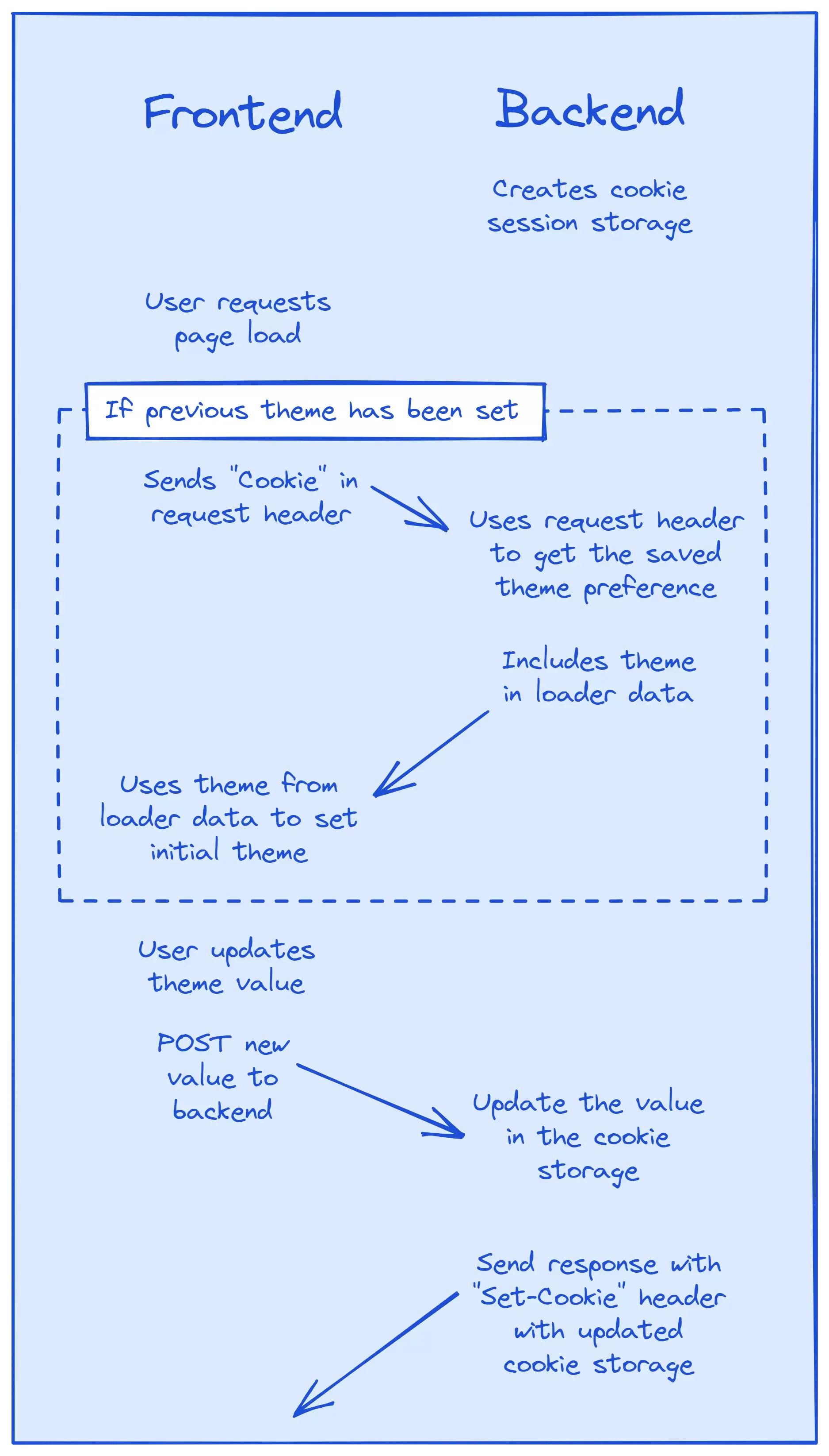
We’re going to use a session cookie to store the user’s theme. Every time the user changes the theme value, we’ll post the new value to a backend action. This will update the theme value in the cookie and set the Set-Cookie header in the response to the new, committed cookie session.
Create the Session
Remix gives us an abstraction to help us manage cookie sessions, createCookieSessionStorage which is exactly what we need.
Let’s start by creating a new file, utils/theme.server.ts.
import { createCookieSessionStorage } from '@remix-run/node';

import { Theme, isTheme } from './theme-provider';

const sessionSecret = process.env.SESSION_SECRET;
if (!sessionSecret) {
  throw new Error('SESSION_SECRET must be set');
}

const themeStorage = createCookieSessionStorage({
  cookie: {
    name: 'my_remix_theme',
    secure: true,
    secrets: [sessionSecret],
    sameSite: 'lax',
    path: '/',
    httpOnly: true,
  },
});

async function getThemeSession(request: Request) {
  const session = await themeStorage.getSession(request.headers.get('Cookie'));
  return {
    getTheme: () => {
      const themeValue = session.get('theme');
      return isTheme(themeValue) ? themeValue : null;
    },
    setTheme: (theme: Theme) => session.set('theme', theme),
    commit: () => themeStorage.commitSession(session),
  };
}

export { getThemeSession };
There’s a lot going on here, so let’s step through it slowly.
First, we create our cookie session storage with the aptly named createCookieSessionStorage. This will handle all the session storage for us - we don’t need any backend services or databases to use it.
The options for the cookie come from the attributes in the MDN Set-Cookie docs. We’re going to let the platform do its thing.
The only exception is secrets, which isn’t a Set-Cookie attribute. Secrets are used to sign a cookie’s value. The server then uses the secrets to verify that the value hasn’t been modified or tampered with.
We want the value of secrets to be, well, secret. For this example, we’ll just load the secret from an environment variable. This means we’ll need to set the environment variable in our .env file. Then, during development, we can use dotenv to load the variable when the app starts.
Now that we’ve created the cookie session storage, we’ll create getThemeSession. It will take the cookie value from a request header and use it to get the current cookie session. We’ll then return an object with three helper functions:
getTheme- returns the current theme value stored in the cookie session (ornullif it isn’t a valid value).setTheme- sets the current theme value in the cookie.commit- stores all the data in the Session and returns the Set-Cookie header. We’ll need this for our HTTP responses later.
You may have also noticed we’re using a new function, isTheme, from utils/theme-provider.tsx. It checks whether an unknown value is a valid theme value and allows TypeScript to narrow the type to Theme.
// ...

const themes: Array<Theme> = Object.values(Theme);

function isTheme(value: unknown): value is Theme {
  return typeof value === 'string' && themes.includes(value as Theme);
}

export { isTheme, NonFlashOfWrongThemeEls, Theme, ThemeProvider, useTheme };
Create “Set Theme” Action
Now whenever the theme is updated by the user, we want to let the server know so it can update the value of the cookie. Usually, our server actions are associated with a particular route. In this case, though, we want to call our action from our theme provider, which isn’t a route.
We need a route that will define an action but which won’t render anything. We can think of this route as an API endpoint on the server. We’ll be able to call this action by using the Remix hook, useFetcher.
Let’s create our route, routes/action/set-theme.tsx.
import { redirect } from '@remix-run/node';
import type { ActionFunction, LoaderFunction } from '@remix-run/node';

export const action: ActionFunction = async ({ request }) => {
  // TODO
};

export const loader: LoaderFunction = () => redirect('/', { status: 404 });
By not returning any default component, Remix will use it as a resource route.
Now let’s finish our action. This is what we’ll be calling when the user changes their theme.
import { json, redirect } from '@remix-run/node';
import type { ActionFunction } from '@remix-run/node';

import { getThemeSession } from '~/utils/theme.server';
import { isTheme } from '~/utils/theme-provider';

export const action: ActionFunction = async ({ request }) => {
  const themeSession = await getThemeSession(request);
  const requestText = await request.text();
  const form = new URLSearchParams(requestText);
  const theme = form.get('theme');

  if (!isTheme(theme)) {
    return json({
      success: false,
      message: `theme value of ${theme} is not a valid theme`,
    });
  }

  themeSession.setTheme(theme);
  return json({ success: true }, { headers: { 'Set-Cookie': await themeSession.commit() } });
};
We use the request object to get the current theme session and the new theme value.
The new theme value comes from request.text() which gives us the request body. However, it’s in the form of a query string (e.g. 'theme=light') so we need to extract the theme value. The easiest way to do that is by using URLSearchParams to read our query string and then .get() the value for the key we want (in this case, 'theme').
If the theme value is valid, we can update the theme session and return a success response. This is where we set the Set-Cookie header (using the cookie storage commitSession function).
Update the Theme Cookie Value
Now we have our action, we can use useFetcher to call it whenever the theme updates.
function ThemeProvider({ children }: { children: ReactNode }) {
  // ...

  const persistTheme = useFetcher();

  // TODO: remove this when persistTheme is memoized properly
  const persistThemeRef = useRef(persistTheme);
  useEffect(() => {
    persistThemeRef.current = persistTheme;
  }, [persistTheme]);

  const mountRun = useRef(false);

  useEffect(() => {
    if (!mountRun.current) {
      mountRun.current = true;
      return;
    }
    if (!theme) {
      return;
    }

    persistThemeRef.current.submit({ theme }, { action: 'action/set-theme', method: 'post' });
  }, [theme]);

  // ...
}
We’re using a useEffect to watch for changes to the theme value and send any updates to the backend.
We only want this useEffect to run when the theme changes to a non-falsy value. The useEffect will run when the provider is initially mounted (despite the theme not being changed), so we use a mountRun ref to check if it’s the initial mount and return without updating the cookie if it is.
Finally, we use the value returned from useFetcher to submit the new theme to the action.
- We pass in the new
themevalue in the body. - In the options, we define which route we would like to call the action of (in this case,
routes/action/set-theme.tsx) and the method of submitting our data (in this case, a POST request).
Set Initial Value From Cookie
Now we have our theme value persisted in a cookie session and we’re updating our cookie every time the theme changes. Now we can use that value to set the theme for the initial render if the user has previously chosen a theme preference.
Let’s start by adding a loader to our root route, root.tsx, where we’ll return the theme from the theme session. This will be type Theme if there is a saved theme or null if a preference hasn’t been saved.
import type { LoaderFunction } from '@remix-run/node';
import type { Theme } from '~/utils/theme-provider';
import { getThemeSession } from './utils/theme.server';

export type LoaderData = {
  theme: Theme | null;
};

export const loader: LoaderFunction = async ({ request }) => {
  const themeSession = await getThemeSession(request);

  const data: LoaderData = {
    theme: themeSession.getTheme(),
  };

  return data;
};

// ...
Our component, AppWithProviders, can pass this value to our theme provider so that it can calculate the initial state.
import { useLoaderData } from '@remix-run/react';

// ...

export default function AppWithProviders() {
  const data = useLoaderData<LoaderData>();

  return (
    <ThemeProvider specifiedTheme={data.theme}>
      <App />
    </ThemeProvider>
  );
}
In utils/theme-provider.tsx, we’ll update our provider so that it takes the specified theme, checks that it is a valid theme, and if so, sets the initial theme value to that value.
function ThemeProvider({
  children,
  specifiedTheme,
}: {
  children: ReactNode;
  specifiedTheme: Theme | null;
}) {
  const [theme, setTheme] = useState<Theme | null>(() => {
    if (specifiedTheme) {
      if (themes.includes(specifiedTheme)) {
        return specifiedTheme;
      } else {
        return null;
      }
    }

	// ...
  }

  // ...
};
Finally, if we already know the theme preference for the initial render, we no longer need our script tag to check the user’s preference before hydration. Let’s also pass a flag to NonFlashOfWrongThemeEls to let it know whether the theme is coming from server side rendering.
function App() {
  const data = useLoaderData<LoaderData>();

  // ...

  return (
    <html lang="en" className={clsx(theme)}>
      <head>
        {/* ... */}
        <NonFlashOfWrongThemeEls ssrTheme={Boolean(data.theme)} />
      </head>
      <body>{/* ... */}</body>
    </html>
  );
}function NonFlashOfWrongThemeEls({ ssrTheme }: { ssrTheme: boolean }) {
return <>{ssrTheme ? null : <script dangerouslySetInnerHTML={ __html: clientThemeCode } />}</>;
}We have a working, persisted dark mode 🎉🎉🎉
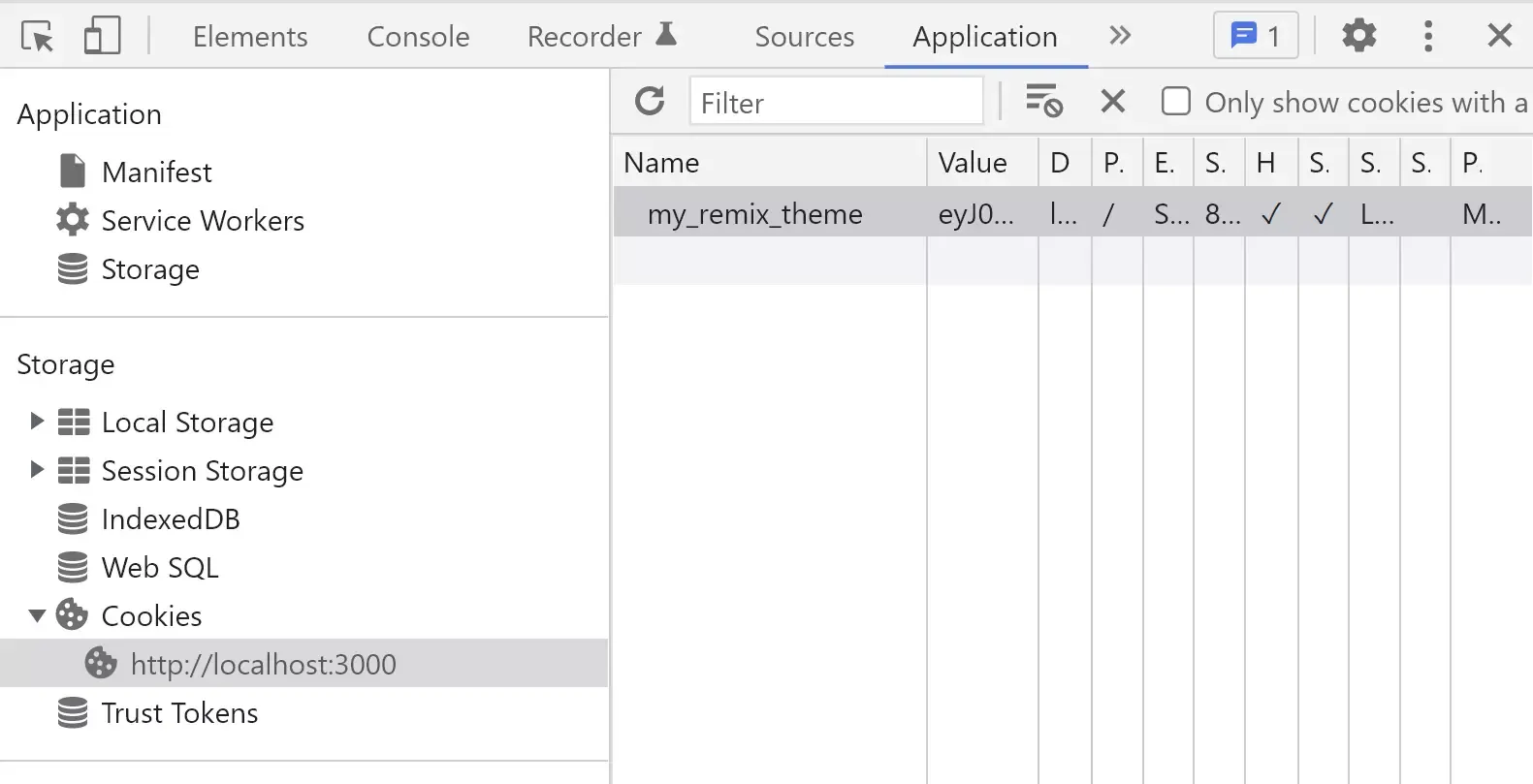
And the dev tools show us that our cookie is being successfully created and stored.
Finishing Touches
If the user updates their system theme preference while they have our app open, we can assume that they will want our app’s theme to match their latest system preference. We can do this by adding an event listener to the match media query to update the theme if it changes.
function ThemeProvider({ children, specifiedTheme }: { children: ReactNode; specifiedTheme: Theme | null }) {
  // ...

  useEffect(() => {
    const mediaQuery = window.matchMedia(prefersDarkMQ);
    const handleChange = () => {
      setTheme(mediaQuery.matches ? Theme.DARK : Theme.LIGHT);
    };
    mediaQuery.addEventListener('change', handleChange);
    return () => mediaQuery.removeEventListener('change', handleChange);
  }, []);

  // ...
}
Finally, let’s add a color-scheme meta tag to improve the dark mode default styling.
We first need to update NonFlashOfWrongThemeEls to also add a meta tag based on the theme value.
function NonFlashOfWrongThemeEls({ ssrTheme }: { ssrTheme: boolean }) {
  const [theme] = useTheme();

  return (
    <>
      <meta name="color-scheme" content={theme === 'light' ? 'light dark' : 'dark light'} />
      {/* ... */}
    </>
  );
}
However, there will be cases where the user hasn’t chosen a preference yet and our initial theme is null (i.e. the SSR can’t know what theme preference the user has). We’ll have to use the same approach we used to define our initial theme value and update clientThemeCode so that it uses the right meta tag before hydration too.
const clientThemeCode = `
;(() => {
  // ...

  const meta = document.querySelector('meta[name=color-scheme]');
  if (meta) {
    if (theme === 'dark') {
      meta.content = 'dark light';
    } else if (theme === 'light') {
      meta.content = 'light dark';
    }
  } else {
    console.warn(
      "Hey, could you let Matt know you're seeing this message? Thanks!",
    );
  }
})();
`;
The Power Of Remix
Implementing dark mode is a good way to find the limits of what a framework will let you do. With other frameworks, the area of concern is just a portion of the <body> after it has been hydrated. But Remix gives you full control of the HTML from the moment it loads.
You can find the finished code in the Remix examples. And if you have any questions, feel free to message me on Twitter!